Color in photography
If you're fortunate you can see the world in color. Most people can. A small group of people have an enhanced feature called synesthesia where the brain maps colors to features such as music, numbers, and letters. Insects use colors to their advantage, navigating via color to guide them to the most bountiful sources of nectar. Some animals can see colors although not all of them find it useful and not all of them see colors as humans do.
“The portraits in colours, by their singularly close approximation to nature, no less delighted than astonished us. -- The Morning Herald, London, 1845
If you're a honeybee or a hummingbird, color is essential to your sustenance. If you're a synesthete, color enhances your world. If you lived in the 1840s and were a first-state appreciator of the nascent art of photography, you yearned for color to properly record nature in an image . But the technology available at the time couldn't accommodate you.
In ancient times when humankind began to paint images of the world around them they used pigments to represent their universe. Medieval illuminated manuscripts used color to draw the reader into the words on the page. Renaissance and classical portrait painters used subtleties of color to enhance the reality of their subjects. Color was an essential magnet to attract attention. It was part of the natural world.
When photography was invented in 1839 the first daguerreotypes and ambrotypes were limited to monochrome by available technology, but it didn't take long for critics of this new art form to demand more. In the 1840s Blackwoods Magazine in London thought early photographic images were "absolutely fearful" and claimed that photos "must want color" to be acceptable representations of natural objects, especially human subjects. As a result, color artists became popular, using their skills as painters to apply color to photographs, and they remained essential to photo art until technology advanced sufficiently to allow true color images to be produced by the camera in the late 1890s.
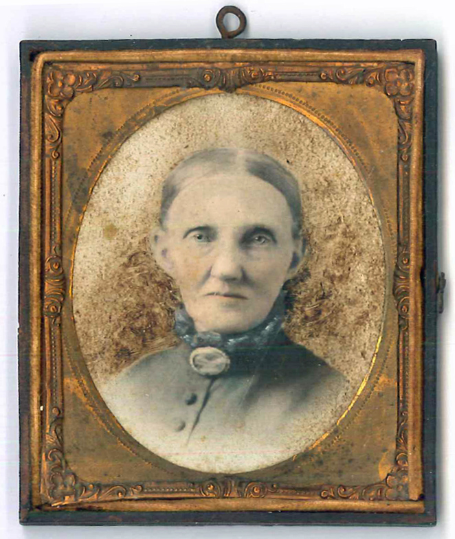
Even in our own photo gallery we can see this phenomenon in practice. This ambrotype from the mid-1850s shows a delicate color applied by hand, with facial tones rendered realistically and the blue pigments of this lady's dress and collar brought out in detail. These were keepsakes of a rare and special nature, preserving the face of a relative who would eventually pass away, so a realistic rendition was of vital importance.
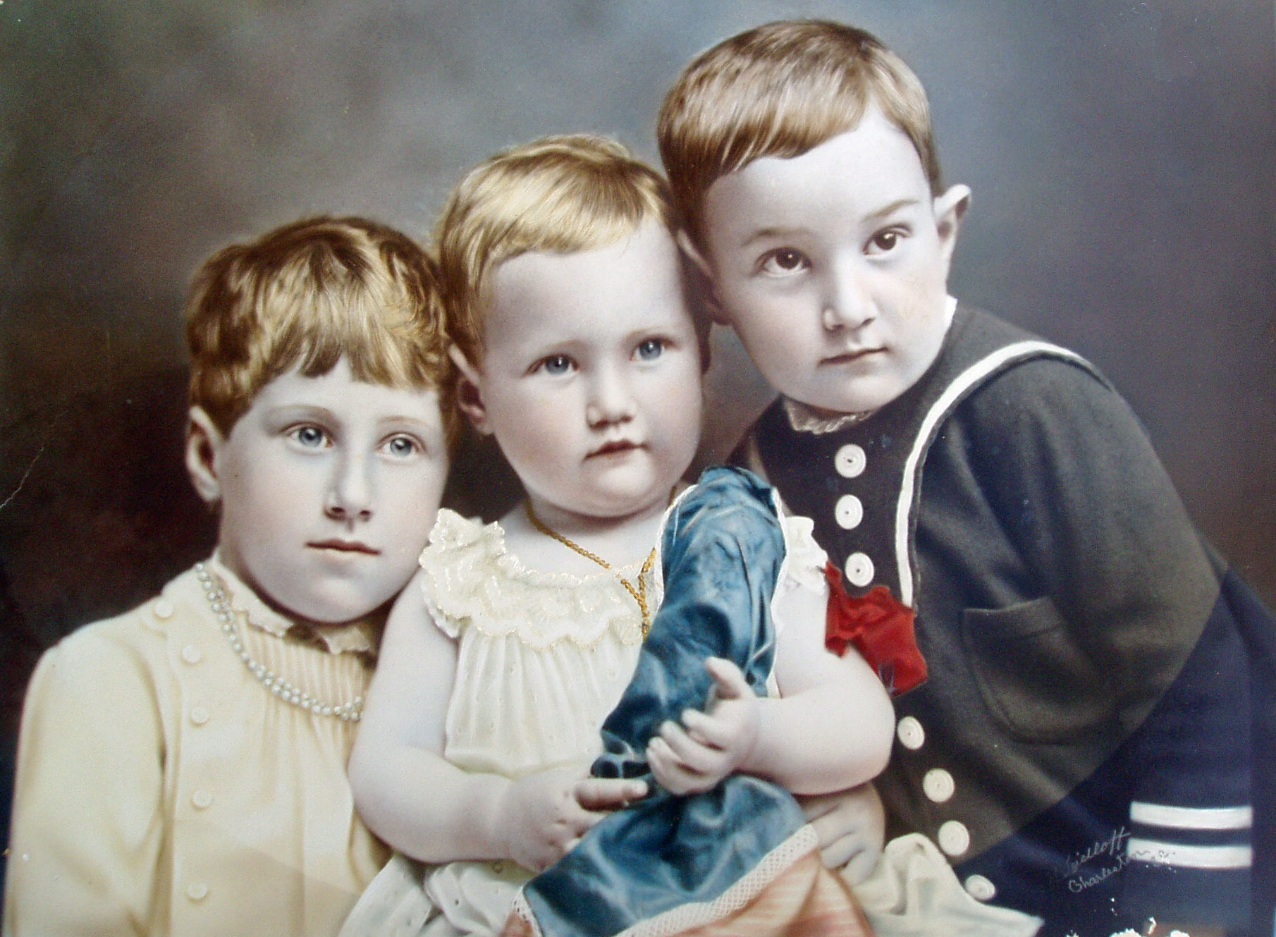
This portrait in the collection of Louis Quin could be mistaken for a painting, but it is in fact a hand-tinted photograph from 1889, produced in Charleston, South Carolina. It shows the three oldest children of George W. Jatho and his wife, Arnolda von Oven Jatho. The colors retain their vivacity except for a little fading on Herbert's sailor suit in the right corner. There's some poignancy associated with this photo: Herbert died at age five the same year this image was produced, so it's the only visual document of his existence.
Applying color to black and white prints engenders some controversy today, although there's a clear historical precedent for its use. Online applications make it easy to colorize photos from the past, or to restore faded Kodachrome prints. Decisions of this type are not an affront to the orignal intent of the photographer. Black and white photography has its champions, and I'm one of them. Photos by Diane Arbus or Dorothea Lange represent a starkness and drama that color would interfere with, it can be safely argued.
When is it right to colorize?
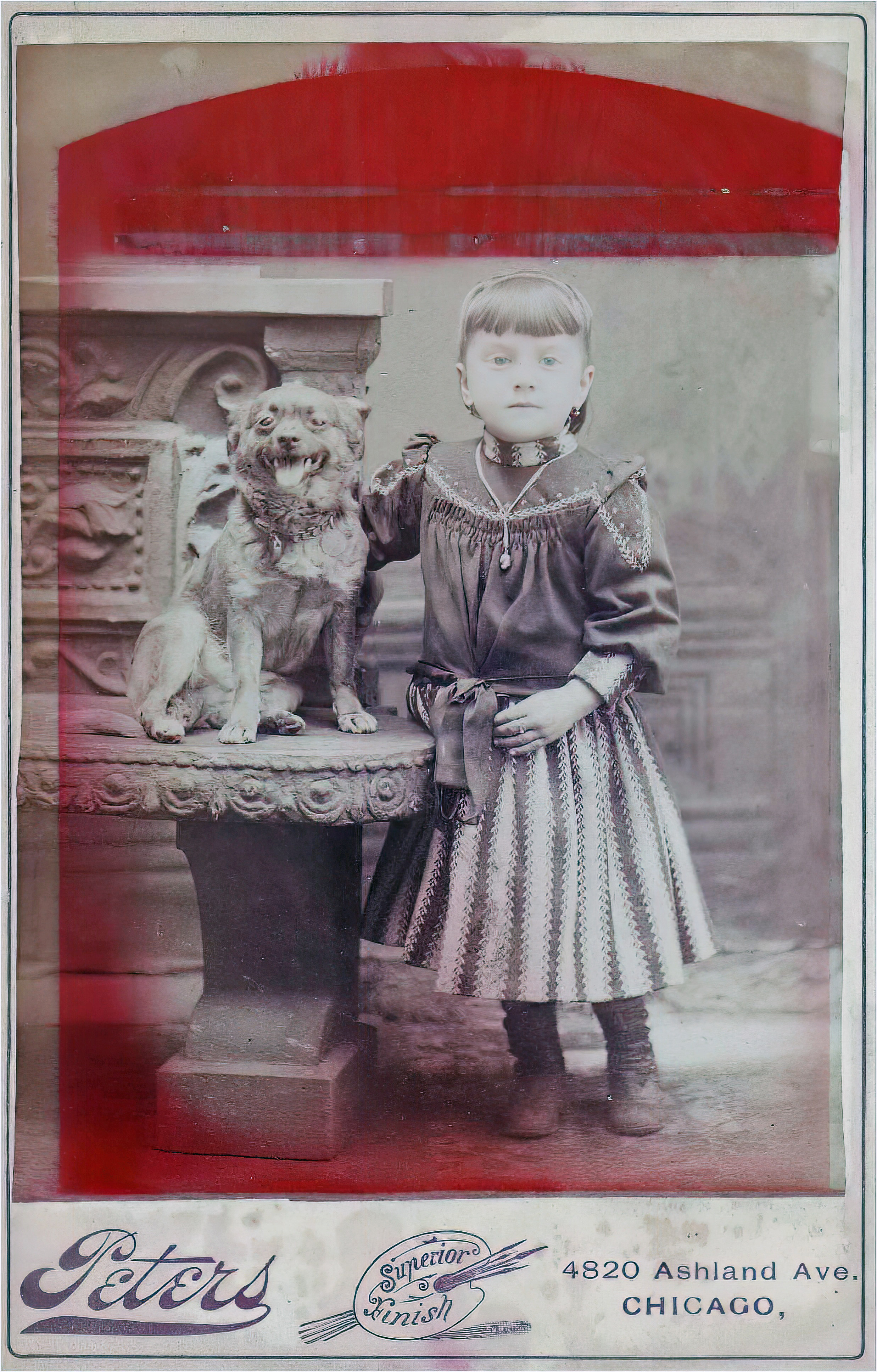
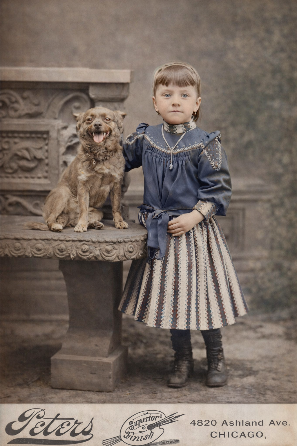
One good reason: when you can correct damage to an old photograph, increasing its accessibility to modern viewers. This photo of Margaret "Maggie" Petersen was taken in 1892. Maggie, the daughter of Hans and Catharina Petersen, was born in Nebraska but came to Chicago when her parents relocated the family there around 1889. She was about five years old in this cabinet card by Peters Studio, Chicago. Maggie is wearing the same cameo that her father Hans Petersen wore in his wedding portrait in 1878. Her pet dog is wearing a handsome necklace with medallions.
But the image is marred by the red imprint leaked from the cardboard frame that her mother used to display the photo. Applying colorization to the photo mostly cleans this up and makes it possible to focus on the subject and the composition of the image. It also makes it much more pleasant to display, either online or as a print framed on a mantlepiece. The original photo, copied from Catherina Petersen's archive, remains untouched and accurately reflects how it appears in the archive with all the flaws of age intact.
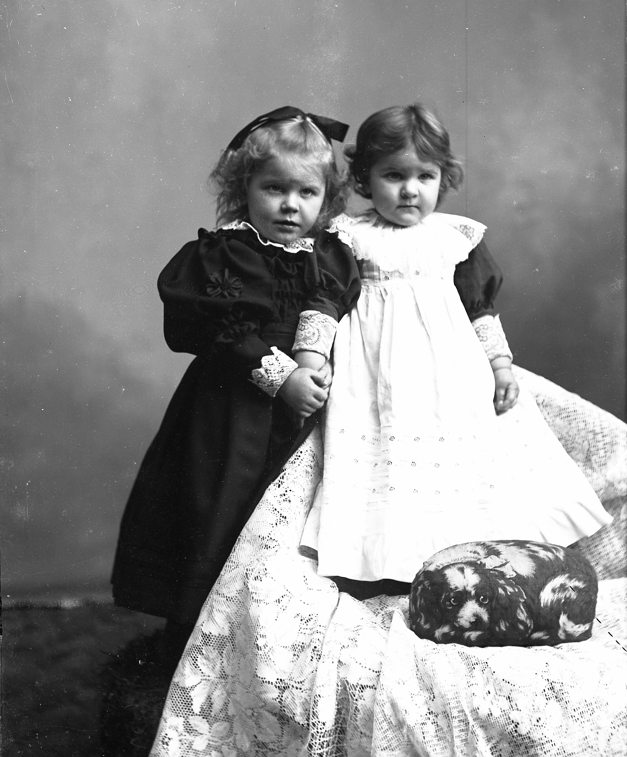
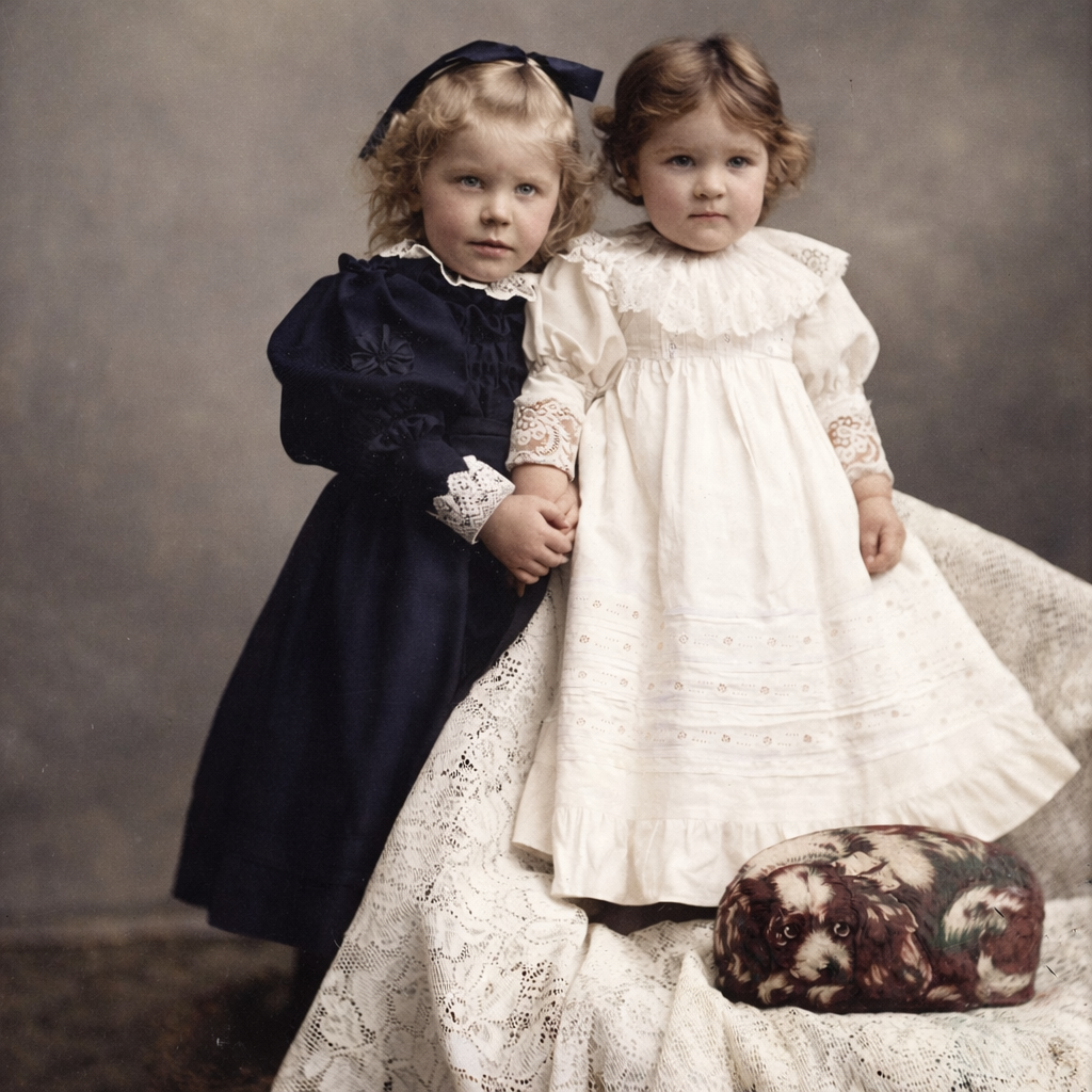
With undamaged glass negatives colorization can be even more useful. The original of Antonia and Alvina Hannah Gaul from 1895 in Michigan is gorgeous quality but has some shadows that obscure facial details. The colorized version highlights the girls' faces in a way that the black and white version doesn't include. A bonus: the photographer's prop, a puppy version of the famous "Ithaca Cat" toy of the era, stands out much better in the colorized version. This is a case where clarifying the photo allows the viewer to see the little girls as they probably looked in real life.
A modern-day reason for colorization: younger generation family members often respond to color photos rather than black and white, and for genealogists hoping to capture the attention of millennials, Gen-X, and even younger folk, presenting infomation in a more accessible format is a plus. One of our family actually confessed to this syndrome. He admitted that old black and white photos never grabbed his attention, but as soon as he could browse through a collection of colorized images, his imagination was piqued.
Presentation of family history is an important component of inspiring future generations of historians. At some point they'll need to take over from us. As long as historical photos are remain the original resource, and colorized images are clearly labeled and understood to be derivative, we're doing the best we can to meet the needs of all devotees of our history. Colorization is a tool that we can use to make the vital connection between the past and the present.
For more information: an excellent resource is this article by Sara H. Ferguson, "In Living Color: Process and Materials of the Hand Colored Daguerreotype" in The Daguerreian Annual 2008.